Published July 15, 2026
Upgrading packaging to act as a camera-ready product signal makes selling easier by turning unboxing videos into high-converting visual demonstrations.
E-commerce packaging replaces the physical retail shelf, immediately communicating brand values, tactile material quality, and formulation standards to viewers before a creator even tests the item.
Because the physical structure carries the narrative, the product sells itself through visual evidence rather than scripted claims.
The Shelf Is Now a Screen
The physical shelf once served as the primary emotional touchpoint. Brands designed specifically for the hand that reached and the eye that scanned a crowded aisle.
That exact moment of discovery has now migrated to the unboxing frame, taking place in a living room shot in natural light with a smartphone propped against a water bottle.
YouTube unboxing searches exceed 90 million per month across tech and lifestyle categories. Meanwhile, Google and Ipsos data indicates that unboxing content influences buying decisions for Gen Z and millennial shoppers at a rate matching traditional written product reviews.
Packaging no longer functions solely as a protective structure for transit. It operates as a dense product signal that broadcasts character before anyone reads a single marketing claim. Brands investing in custom design build a physical storyboard that gets replayed and shared across algorithmic feeds.
Founders who centralize their brand assets and packaging narratives often find that product coverage lands with more depth. Understanding which structural elements perform best on camera allows a business to systematically turn its boxes into automated sales tools.
What a Box Says Before Opening
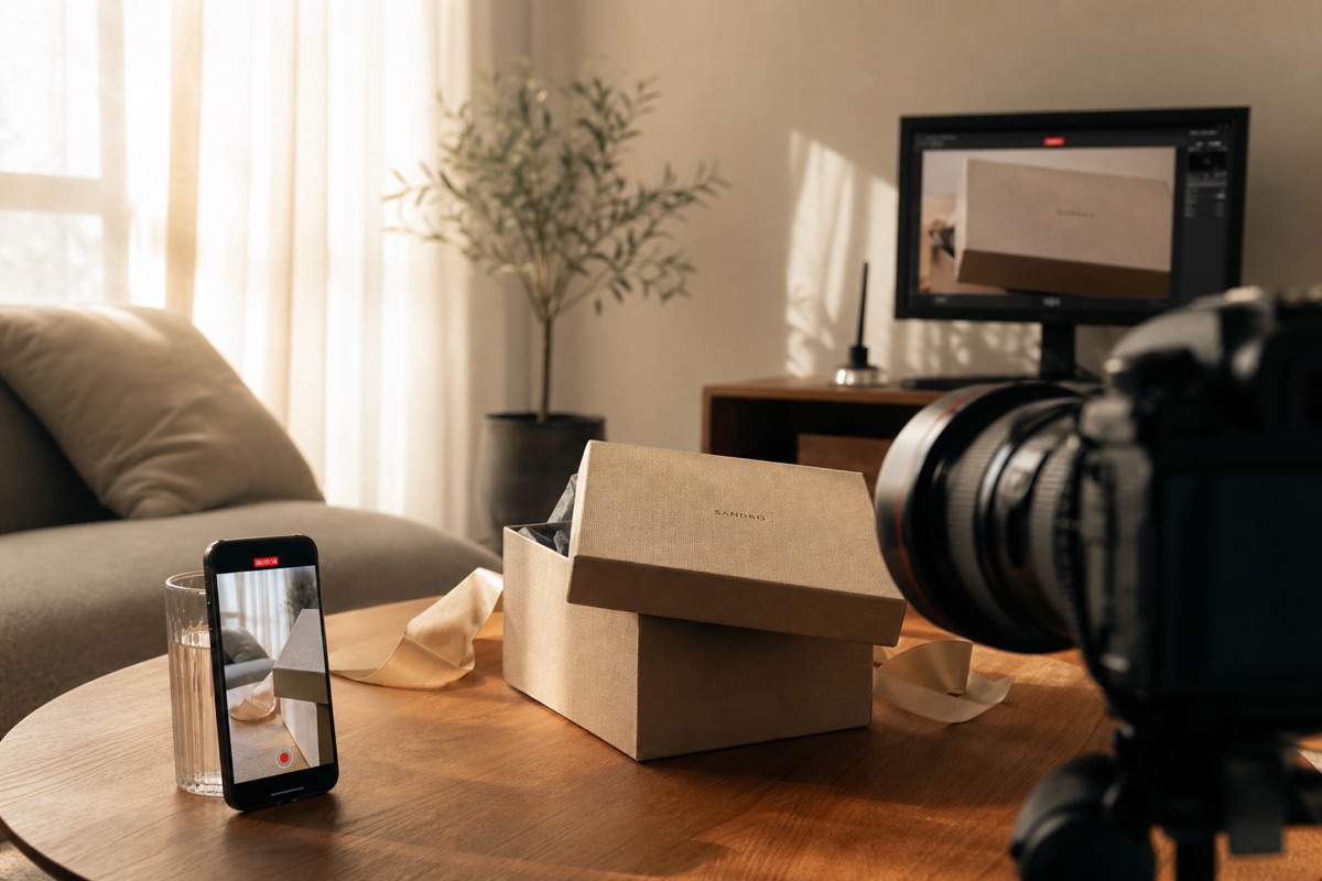
The heavy 1200gsm board of a rigid box signals structural durability and premium positioning. Un-laminated matte surfaces communicate minimalist restraint, while bold monochromatic colour blocks signal high energy.
Material choice directly dictates perception, as seen when over 86% prefer glass containers over plastic for food items. These variations function as deliberate brand statements transmitted through raw material selection rather than subjective design preferences.
Texture serves as the first signal a creator's hands transmit to a viewer, overriding whatever script they planned to read. The sharp crinkle of 17gsm custom tissue paper, the distinct smoothness of a soft-touch laminate coating, and the heavy structural snap of a magnetic closure all read clearly on camera.
Verbal narration becomes unnecessary. The creator's hands instinctively do the communicating by pausing to rub a thumb over an embossed logo or snapping a lid shut.
Colour palettes render differently under harsh LED ring lights compared to soft natural daylight, forcing brands to test their Pantone choices in multiple environments. A warm terracotta carton that glows in afternoon sun frequently flattens into a dull brown under artificial studio lights. Designing for creator content requires selecting hues that hold their saturation across both setups.
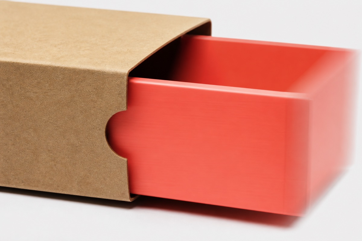
The outer packaging also establishes a baseline expectation for the internal reveal sequence. A restrained kraft exterior that opens to reveal a richly saturated interior tray creates a visual contrast that prompts creators to pause their recording.
Sustainable materials signal environmental values before the influencer reads a single word from a press release.
Utilizing 100% recycled structural board, soy-based inks, plantable seed paper hang tags, and fully compostable cornstarch void fill proves ecological commitment through physical evidence.
Functional features also resonate strongly; 78% of consumers understand how vacuum packaging maintains food freshness, and approximately 91% are willing to purchase these technologies after learning about them.
Creators who prioritize sustainability spot these tactile details and name them on camera unprompted, earning authentic endorsements rather than forced talking points.
Details That Live on Camera
1. Tactile Texture Surfacing
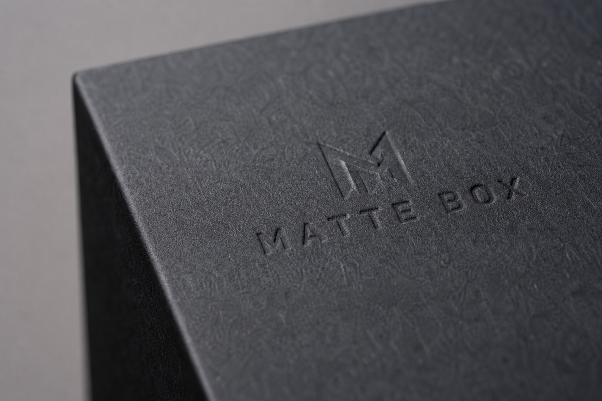
Applying matte laminates, soft-touch coatings, linen-effect paper wraps, or deeply debossed logos provides the camera with immediate physical topography to capture. A creator running a thumb across a debossed logo skips verbalizing the item's quality, because the lens catches the shadow resting inside the relief.
Utilizing contrast textures creates a tactile reveal that translates visually to the audience. Pairing a high-gloss exterior sleeve with a rough uncoated interior tray consistently triggers unprompted commentary from influencers.
2. Colour Sequencing and Flow
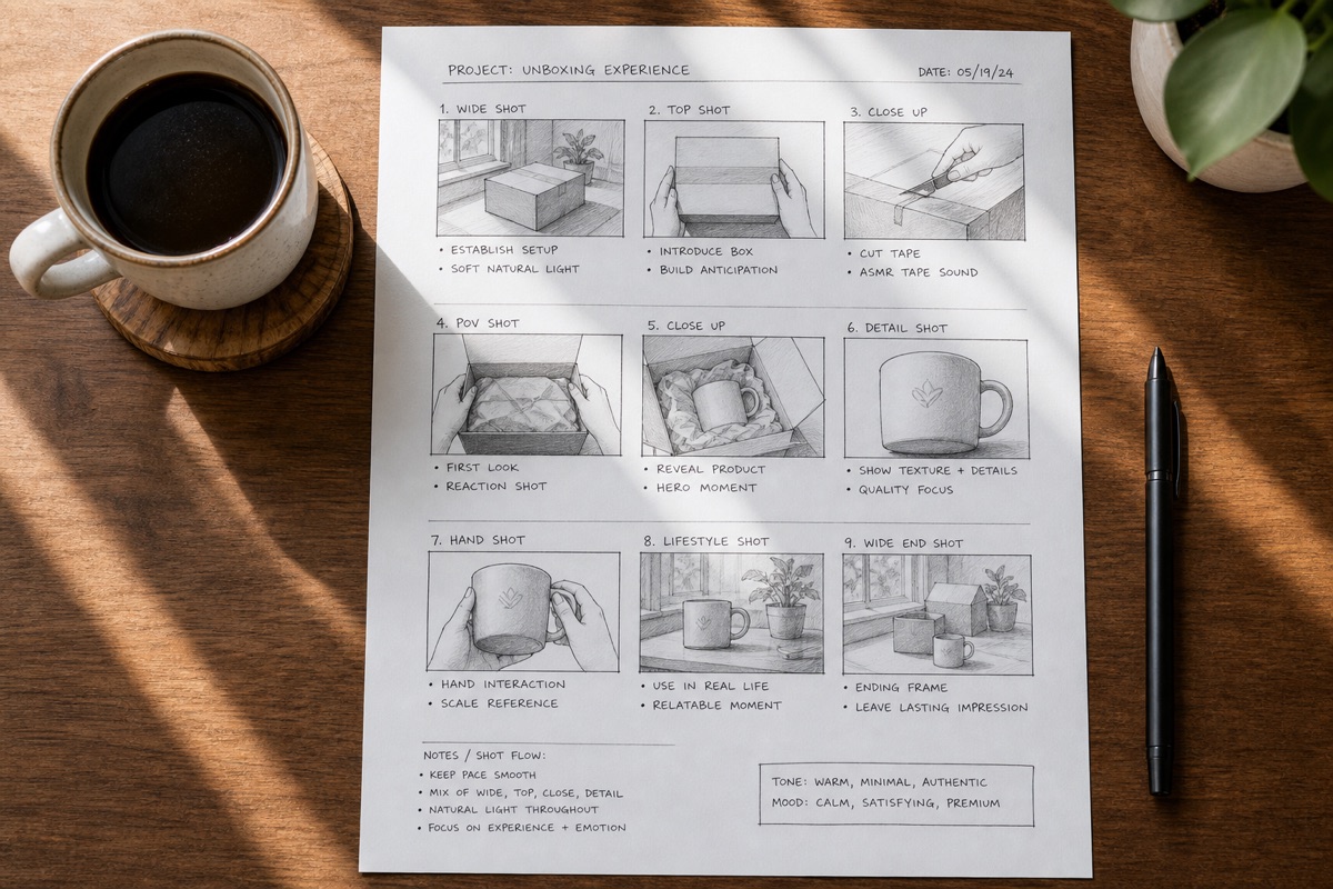
The sequence in which a brand reveals its colours matters as much as the individual hex codes chosen for printing. Packaging designers must treat the unboxing flow as a strict storyboard. This moves the viewer's eye from the outer shipper shell, down to the first tissue layer, into the custom product bed, and finally to the primary vessel.
Establishing heavy inner palette contrast generates a visual disruption that drives video replays and algorithm saves.
Maintaining strict colour consistency across the tissue paper, insert cards, and primary product reads as intentional craft rather than a manufacturing accident.
3. Custom Inserts and Tissue Routing
Custom printed tissue featuring branded geometric patterns or signature brand colours deliberately slows down the reveal sequence. This turns every paper fold into an individual video frame. Including dried botanical sprigs or targeted fragrance sachets introduces a sensory dimension the camera lens cannot capture.
Creators are then forced to vividly describe the scent aloud to their audience. Adding a wax seal or a heavy hand-stamped card injects a human element into the parcel. The creator will typically pick up the card and hold it to the lens for a dedicated close-up shot.
4. Visible Sustainable Materials
Selecting recycled content board, compostable molded pulp trays, and FSC-certified paper stock transforms ethical business choices into highly shareable content moments. The critical distinction lies in visibility. Structural sustainability that a creator can see, touch, and describe on screen routinely gets mentioned.
In contrast, carbon offset data buried deep inside a brand FAQ page remains invisible to the viewer. Engineering sustainability directly into the physical experience of tearing open the parcel earns unprompted creator mentions.
Briefs That Teach Packaging Details
Most standard influencer briefs function as rigid messaging documents that dictate hashtags, key product claims, and mandatory calls to action while ignoring the physical box. These outlines rarely tell creators what the structural packaging is designed to do, which physical moments warrant a tight camera zoom, or why the brand selected a specific tissue paper weight.
As a direct result of this informational gap, creators rush through the unboxing sequence. They might miss the hidden coral interior, drop the custom scent sachet out of frame, and produce video content that complies with the contract but feels narratively hollow. To fix this disconnect, brands must implement a packaging-aware creator brief that utilizes a six-point framework.
- Packaging story in one sentence: Define the core emotion the outer experience conveys, instructing the creator that the box is designed to feel like receiving a heavy hardcover book rather than a standard warehouse parcel.
- Highlight sequence: Identify the exact moments in the unboxing flow designed to surprise the viewer, specifically directing the creator to hold on the coral interior tray for a full beat before reaching for the bottle.
- Texture callouts: Name the exact surfaces worth touching on camera, telling the creator to run their thumb across the soft-touch matte lid so the microphone picks up the friction.
- Insert context: Explain the origin of the botanical scent sachet and the hand-stamped note so the creator can narrate the physical details naturally instead of reading generic adjectives.
- Sustainability talking points: Frame the FSC-certified paper and compostable void fill as ready-to-read talking points rather than dry corporate footnotes.
- What not to rush: Explicitly identify two structural moments that earn a deliberate pause or a second camera pass.
Brands organizing these briefing materials into a structured press resource alongside imagery, spec sheets, and brand narrative build better media relationships.
Tools designed specifically for media asset organization, including digital press room platforms and specialized creator kits, bridge the gap.
They make the difference between a creator who nails the narrative on the first try and one who simply guesses at the brand's intention. Centralizing the packaging context keeps the physical product signal intact across hundreds of different video uploads.
Brands Getting Unboxing Details Right
One popular beauty label includes a heavily branded sticker sheet inside every order, introducing an emotional, non-functional insert into the shipping process. This specific inclusion turns both paying customers and paid creators into active content generators before they uncap the primary cosmetic.
The sticker sheet transforms into a signature unboxing moment across thousands of videos. Replicating this momentum requires identifying one highly visual, non-functional insert that serves as an instant identifier for the camera.
A notable botanical home goods provider utilizes dried botanicals, heavy hand-tied ribbons, and earthy natural textures throughout every layer of their shipper boxes. The packaging physically performs as an aspirational lifestyle object.
Creators frequently style it, arrange it alongside fresh fruit, and photograph it heavily, extending the unboxing sequence into a permanent flat lay. Designing primary packaging elements with a clear aesthetic life beyond the initial reveal earns extended screen time.
A luxury fragrance house relies on crisp black and white typographic tissue paper paired with signature oval labels to make parcels recognizable in any chaotic video frame. Creators treat the deliberate unwrapping process as a quiet ritual.
The fragrance house trained its audience to view opening a box as a luxury ceremony. Investing in one repeatable visual signature trains an audience to recognize a brand's footprint before the glass vessel appears on screen.
A prominent health supplement provider ships its daily synbiotic in sustainable outer packaging explicitly designed to be repurposed as a travel container. This turns the material's second-use story into creator content itself.
Creators regularly demonstrate these alternative travel uses on camera, allowing the physical packaging to earn multiple distinct content moments across a single gifting cycle. Engineering one specific structural component with a visible second-use application gives people a functional reason to feature the box multiple times.
Making It Happen
Leverage the four camera-ready elements of tactile texture, deliberate colour sequencing, custom inserts, and visible sustainable materials. Deploying a structured creator brief framework eliminates on-camera guesswork. Consolidating press resources ensures the packaging story, high-resolution brand assets, and context travel together as one unified informational package.
To execute this transition immediately, start by auditing current packaging against the four camera-ready elements. This helps clearly identify which specific textures perform on screen and which un-laminated surfaces disappear under studio lights. Write a dedicated packaging brief for the next product drop or seasonal gift set, and physically send that printed document alongside the actual item.
Finally, consolidate the packaging story, digital brand assets, and creator context into a single organized press resource. The visual narrative remains consistent from launch day forward, rather than being reconstructed differently by every creator.